
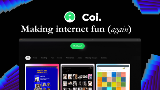
Remember when the internet felt like a giant treasure hunt instead of just… cycling through the same five apps? Yeah, me too. That’s why I started COI (Corners of Internet)—a place where I dig up weird, fun, and happy corners of the web so you don’t have to.
No algorithms. No doomscrolling. Just pure internet exploration.
If it’s cool, underrated, or a little unhinged, it goes on COI.
Check it out: www.cornersofinternet.com
Also, if you’ve got a favorite weird site, drop it below! I’m always looking for new rabbit holes to fall into.
Maybe it’s a generational thing (I’m a 50+), I don’t know, but when I see a ‘Buy me (something)’ or a ‘tip me’ first thing first on the home page even before I can get any idea of what I will find on the website I’m not likely to explore further. I thought you might want to know about that, even I may be in the minority.
Just in case:
- Nope, I’m not cheap. I just want to know who and why I’m supposed to be paying a coffee to (or a pizza) before I decide I want to do it, or not to do it.
- I’m always very happy to see people trying to refocus attention toward a less corporate-owned Internet.
- I hope it was clear it’s nothing personal, just my first reaction on visiting your page. I’ll explore it further ;)
I totally get it, yet I contemplated that decision a lot. This is a self funded indie project, could use a lotta funding.
But I agree, I will be removing that soon, maybe tug it into the footer or someplace. Not like it is helping me get coffee anyways :D
Thanks for the feedback.
Wait. Why could you use a lot of funding? I run websites, I don’t do adds I don’t charge and I don’t ask for money.
That is part of what made the old internet fun.
What is the money for?
It’s hosted on Framer.
Maybe start smaller and work your way up? They really charge $75 a month AND put you under a bandwidth cap? Yikes.
I don’t think it needs to be hidden or anything, but consider your “before the fold” content, it’s what is most important on a web page and what will grab users in the 2-3 seconds you have to capture their attention before many will click off.
Currently on your site I have to scroll down quite a bit beyond the fold to get to the actual website on my phone, as the top section is taken up by very large text superfluous to the main content.
I know it sucks to have to build for that sort of user, but it’s a large chunk of users, and the rest are just putting up with the inconvenience haha :-)
prominant at the footer or last on a sidebar. a page dedicated to a brief transparency of hosting costs and ongoing labor demands of the project, and current state of funding helps a lot!
if that seems difficult, see if a friend or comrade with ok writing skills ‘interview’ you on the subject for five or ten minutes – sometimes it’s easier to have a friend reflecting to discover one’s finer points of value.
thanks for helping build the webrings and discovery tools of tomorrow.
i’ll be watching your project while i work on my Web Literacy and Navigation materials. :)
Yes, will think about shifting it to the footer + I was working on being open about the spending for the site. A road map page is also under construction.
Thank you so much for the feedback. would love to see what you working on.
Implemented, Road map
Some feedback: the “hi I’m coi” thing at the top? I thought it was another LLM AI thing introducing itself. I closed the tab immediately, but then double checked when I read the rest of this post.
The social media links at the top, especially Twitter, are a negative for me. Fuck twitter and Facebook.
The big color buttons (that are not actually buttons) interspersed with text is a choice but it feels very bad-modern to me. If you’re going for more retro pre-shit, maybe take inspiration from https://evenbettermotherfucking.website/ or friends.
X, Insta, Threads at the top of the homepage
And for that reason I’m out.
The internet used to feel like a treasure hunt because it wasn’t indexed well, and a large part of the surface content were pages made by oddball people letting their weirdness run wild without social limitations.
Sure, algorithms keep most normies in a social media ecosystem, but it’s also not exactly easy for me to make a truly anonymous website about the awesome predictions I’ve made from looking at the patterns in my breakfast cereal every morning - AND just let it be. There’s pressure to promote it, crosspost it, etc. Even the fun of thought experiments posted to a GeoCities page come with risks now.
Maybe I’m jaded and lack the youthful energy to stay up until 4:30am slapping im14amdthisisdeep stuff somewhere. Maybe everyone else that’s just slightly weird still expects to get paid for that with ads when it all used to be free and fun.
Feels a lot more like a minefield nowadays. Good initiative.
Love the idea! Kinda like fark.com before they got all shitty.
I’ve never been on fark what is the story though
Same old story of a community-driven site resorting to ads for revenue. After feedback they started a subscription-based version called totalFark that didn’t have ads. Then they introduced ads on totalFark as well, but didn’t vet their advertisers. So some of the banner ads were running malicious code on users browsers.
Damn that’s crazy… Why allow ads on a subscription site what makes it okay to do that.
What a horrible landing page.
also why would you say it is horrible, I’m collecting feedback. Would help me see what you are seeing, Thank you
Fwiw, I can’t really actually tell what to do on the page, at least on mobile there is a lot going on, including asking for money before I even understand what the page is for.
Updated the buy me coffee button to go to the footer it’s a self funded project that is why it was there on top :(
The initial landing page looks extremely messy and chaotic. It looks like it’s made by an edgy tech intern who’s goal it was to make it as modernly bad as possible. There’s as many fonts as there are words and equally as many random images and CSS tricks that make it extremely hard to understand what the website is trying to do.
I’m sorry for the hard comment, but that’s what I see.
I suggest 2 main things:
- Keep it simple. It’s a skill to keep something both interesting and simple and it’s very important when designing landing pages.
- Split your personal stuff and the service you’re providing. You’re mixing 2 different types of website and it does not feel professional.
I could give a much more in depth review if you want.
Wouldn’t mind in depth review!
- The top banner looks quite out of place. Your whole website uses huge full width vertical separation but the top banner is a tiny thing at the top, that looks like it should be sticky. It also uses round borders while your footer uses square borders.
- The “At your service” could be misunderstood in the current landscape of AI assistents. It might imply some sort of smart interaction.
- I would suggest you emphasis only 1 or 2 words in your landing title. You need to have 1 single thing stand out when they see that for the very first moment. “Coi” does not mean much. “Tiny Corner” “Internet” could work alright together.
- This feels awefully out of place: https://framerusercontent.com/images/NEDqhYBfbsBdcBYtqq012PD2C8.gif Maybe it could in the same emphasis as “Coi”, or be placed somewhere else entirely. I was trying to figure out if it meant some sort of word in the sentence.
- The Buy Me Pizza has been moved to a much better location.
- The second thing I notice when I visit the page is the “Psssst”. It’s like you already ended the stream of information and switch to something else. You give me an option for a waiting list but I have no idea what I’m waiting for.
- I would remove the border at the bottom of the top landing part. Either have a smooth background or have it cut into vertical parts like your footer.
- The “I feel Lucky” is a bit flashy and placed right under the border and above the menu. I think it would be much better if you have it stand out much bigger and with more space around it. It feels like a second class citizen, while it might actually be a fun feature of the website. Small example of what I mean: https://i.imgur.com/ykZyrID.png .
- The stars effect on the hover of “I feel lucky” is nice, but it shows way too fast compared to the rest of your animation heavy page.
- The menu for the types of websites could be made bigger. The thing I don’t like about it is that it has a different background that matches the original too much. https://i.imgur.com/FeUxtUT.png
- Hovering over the cards is the same as the stars. The change is too fast and too harsh
- The badges underneath the cards (NEW, POPULAR) would be better with different colored backgrounds to easily spot what’s new and what’s popular. A trick is to zoom out and have it still make sense. I would also use green or blue for “New” instead of orange.
- “Load more” could use a spinner on the button to show that it’s loading something. Always consider your site to be slow on your end-users machines.
- The footer separation is very nice but might be too huge.
- There are 5 mentions to contact you in your footer: “Let’s connect”, “let’s talk”, “contact me”, “hit me up”, “submit suggestions”. As I said, keep it simple and draw focus to just one of them. Drop the others. (especially the submit suggestions logo)
- “I unearth internet gems that make you go 🤯”. You make it very personal but I fail to understand, even when reviewing this in depth, whether this means you, or your website (which has a persona). Try to make this much clearer.
- Your Blog “Dear Diary” is weird and is like a totally different website. I fail to see what it has to do with your service “find a website from a corner on the internet”. Really try to separate these because it will confuse a lot of people.
I could do more. It’s up to you. I know a lot about UX and have been a web developer for almost 20 years now.
Thank you so much for the pointers, I am reviewing everything.
No problem. Some of it may be harsh but I’m always trying to help.
Good luck on your project!!
Thank you, I made some changes already. Need to figure out the banner. Wil keep you posted, thansk again.
There are 5 mentions to contact you in your footer: “Let’s connect”, “let’s talk”, “contact me”, “hit me up”, “submit suggestions”. — Corrected it “Load more” could use a spinner on the button to show that it’s loading something. Always consider your site to be slow on your end-users machines. — Added
Your Blog “Dear Diary” is weird and is like a totally different website. I fail to see what it has to do with your service “find a website from a corner on the internet”. Really try to separate these because it will confuse a lot of people. ----- Hmm I dont know I wanna use it to store news letters and write blogs
- “Load more” spinner - Added
- I would suggest you emphasis only 1 or 2 words in your landing title. - Done
- The “At your service” could be misunderstood - Removed
- This feels awefully out of place: https://framerusercontent.com/images/NEDqhYBfbsBdcBYtqq012PD2C8.gif - Removed
- “Psssst”. It’s like you already ended the stream - Working on it : I got no idea yet what to do
- I would remove the border at the bottom of the top landing part. - Removed
- i feel lucky - made more space around it
- Buy Me Pizza - moved to footer
others wip
Wow you’re really going for it. Awesome.
Looks a lot better already.
Yes Sirr. Thanks to you.
currently under construction but believe me its going to be huge chadmctrutstruh.fyi i accidentally misspelled it but they said no refunds


